
When it comes to the app redesign, delving into app analytics metrics can truly be a game-changer.
To illustrate, let’s look at the numbers.
Consider the global app market. Whether people are buying things in apps, getting apps for a one-time fee, or seeing ads, the numbers keep going up. Notably, the advertising realm shines with unparalleled growth, escalating from 100.77 billion U.S. dollars in 2018 to a staggering 306.74 billion in 2023. And understanding the factors contributing to the rise in revenues allows businesses to pinpoint what resonates with users.
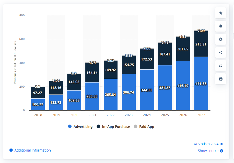
Mobile apps revenue worldwide from 2018 to 2027, by segment (in billion U.S. dollars)
But how do we go about understanding these factors? That’s where metrics come in. By analyzing metrics businesses can gain valuable insights into user behavior. For example, a decrease in churn rate after a design revamp can offer clues about what aspects are influencing user satisfaction.
Our design team at Volpis has assisted many businesses in redesigning their mobile apps to enhance their user experiences and overall success, and now we want to share the insights we’ve gained over the years.
Let’s explore some of the most important metrics when evaluating an app and contemplating a redesign. And if you have any questions about app metrics or are considering a redesign for your app, you can always contact our team via info@volpis.com with any inquiries, our team is always there for you.
Important metrics to look for when considering mobile app redesign
Whether it’s an enterprise application, a SaaS B2B tool, or any other app genre, the decision to revamp the design should be rooted in data. Both qualitative indicators and quantitative factors indicators play a pivotal role.
But what exactly are the most important metrics to use when measuring mobile app design’s impact on user satisfaction?
Type 1: App usage metrics (engagement metrics)

App usage metrics provide insights into the frequency, duration, and depth of user interactions with your app. By examining these metrics, you can gain a better understanding of how your app design impacts user behavior and loyalty. For instance, monitoring the effects of adjustments to your app’s layout or the addition of new features allows you to track changes in metrics such as session length and retention rate.
1) Retention rate
The retention rate signifies the percentage of users who revisit or return after a specific time frame. A higher app retention rate holds positive implications for future earnings generated by the app. This rate can be calculated using the following formula:
Retention Rate = ((CE – CN) / CS)) X 100
CE = number of customers at the end of the period
CN = number of new customers acquired during this period
CS = number of customers at the start of the period
How do you improve retention rates? Simple – dig into your app data. Figure out which parts of the app are making users lose interest or drop off. Once you’ve spotted the issues, tweak your app to fix them. This way, you enhance the user experience, and that means higher retention rates.
2) Adoption rate
The adoption rate measures how many users begin using the app after it’s launched. A low adoption rate might suggest that the app’s design isn’t meeting users’ needs or the app isn’t delivering sufficient value. Here’s the formula for the adoption rate:
Adoption rate = Number of new users/ Total number of users
How do you improve the adoption rate? To get more people to use a product or service, make sure to clearly explain its benefits, solve problems effectively, and create easy-to-follow steps for new users. Also, offer perks or exclusive new features early on to motivate users to try and stick with the offering.
3) Churn rate
The app churn rate tells you the percentage of users who either cancel their subscription, uninstall the app, or simply stop using it. It’s usually measured at 30-day, 7-day, and 1-day intervals after installing the app for the first time.
If you opt for the standard monthly timeframe, you’ll need three data points to calculate the churn rate. Here’s how:
- users who left during the month and divide it by
- the sum of users you had at the beginning of the month
- plus the amount of new users acquired throughout the month.
Multiply that final number by 100 to get the percentage.
How do you improve the churn rate? A significant focus on personalizing the user experience will be required. It’s important to cater to individual preferences and create more engaging and connected interactions.
4) Exit rate
The exit rate shows which screens users left. It reveals the screen a user was on before closing or uninstalling the app. This helps identify screens that aren’t converting well, allowing you to make necessary corrections.
Exit rate = Total visits to a screen/total exists from that screen
How do you improve the exit rate? Simplify processes on the screens where users commonly exit. If there are unnecessary steps or complexities, consider streamlining the user journey. Experiment with different designs or layouts using A/B testing to see which variations lead to lower exit rates.
5) Session length and depth
Sessions in the context of mobile apps are the periods when users actively interact with your app. A session kicks off when a user opens the app and concludes if there’s no activity for a set duration. The duration of a session provides insights into the app’s engagement level.
Another valuable metric is session depth, which indicates how closely a user approaches a specific action, like making a purchase. These metrics are available in Google Analytics under the “Behavior” tab for mobile. To gain a comprehensive understanding of user sessions, you can utilize mobile app analytics tools such as UXCam.
How do you improve session length and depth? Focus on optimizing user experiences by streamlining navigation and improving content relevance. Additionally, consider implementing targeted prompts or incentives to guide users toward key actions within the app.
6) Average screens per visit
This metric shows how well your app’s design captures user interest and keeps them engaged. A higher average of screens per visit indicates a user-friendly design, encouraging smooth transitions between screens.
How do you improve this metric? Consider refining the app’s layout for intuitive navigation, streamlining user interactions, and simplifying the overall design. Additionally, conducting user testing and user interviews can provide valuable insights into potential pain points.
7) Stickiness ratio
When talking about how often users engage with your current app on a daily or monthly basis, it’s essential to consider the stickiness ratio. This ratio is the number of times a user logs into your app.
To calculate the stickiness ratio, simply divide the daily active users by the monthly active users.
How do you improve the stickiness ratio? Consider personalized notifications to re-engage users, streamline the app user interface for ease of navigation, and actively seek user feedback for continuous improvement. Offer features or content that encourage users to engage with the app regularly.
8) User growth rate
Keep an eye on this to make sure your user base is increasing and understand why. Does it jump up after specific events like app updates or other activities?
To boost it, here’s a straightforward formula for calculating your user growth rate:
((Present User Amount – Past User Amount) / (Past User Amount)) X 100
How do you improve the user growth rate? Understand your users’ needs, gather qualitative feedback, and make meaningful updates based on their preferences. Consistent improvement is the key!
9) Time on screen
A user’s time on screen helps measure whether app experiences lead to longer or shorter sessions. Different session lengths indicate how specific experiences affect a user’s time on screen, allowing you to investigate sessions that deviate from the expected duration for each journey.
How do you improve this metric? Focus on streamlining navigation, ensuring content is easily accessible, and addressing any confusing elements.
10) Daily, weekly, and monthly active users
Keep track of how often people use your app – every day, every week, and every month. There are three types of active users:
- Daily Active Users (DAUs): The total number of users who logged into your app on a specific day.
- Weekly Active Users (WAUs): The total number of users who logged into your app in a given week.
- Monthly Active Users (MAUs): The total number of users who engaged with your app over a specific month.
Ideally, you want to see the number of active users who use your app increase each month.
How do you improve this metric? Focus on optimizing key features and experiences based on user behavior data to ensure consistent growth in active user numbers. Additionally, consider gamification elements or loyalty programs to reward user interaction.
Type 2: User experience metrics
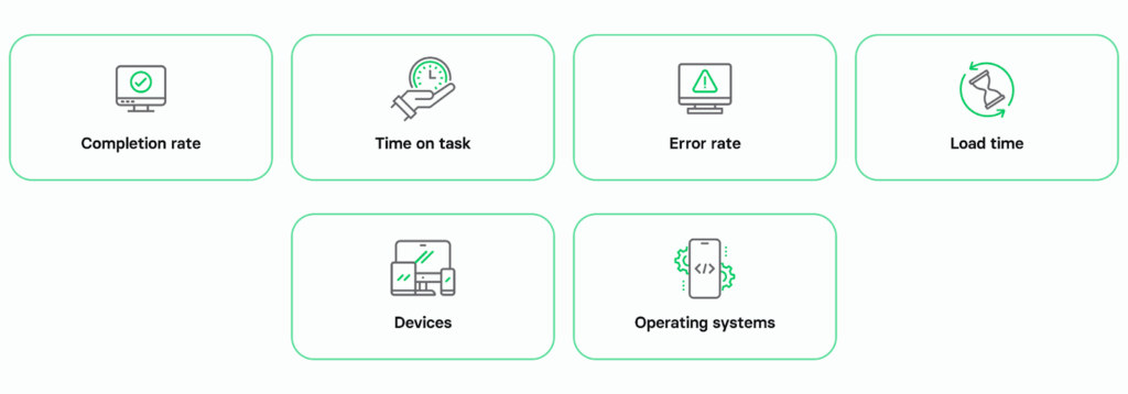
User experience metrics provide insights into how users navigate tasks or achieve goals in your app. For instance, you can assess how alterations in the app’s user flow or interactions influence completion rates, error rates, and user time on task.
1) Completion rate (Task success rate)
The completion rate tells you the percentage of tasks users finish successfully in the app. It helps determine if the app’s UX and design support or hinder efficient task completion. Here is how you can calculate the completion rate:
(#)of users who completed the goal(s) / total (#)of users who have activated the service = Completion Rate
How do you improve the completion rate? Focus on streamlining user flows, minimizing unnecessary steps, and ensuring clear instructions within the app.
2) Time on task
The time on task metric measures how much time users spend completing tasks in the app. If the time on task is longer, it could indicate user confusion or frustration with the app’s UX and design.
To calculate this metric, divide the total time spent on tasks by the number of tasks completed, where total time spent includes all attempted tasks and the number of tasks completed represents those successfully finished.
A prolonged time on task may signal potential issues with the app’s user experience or design.
How do you improve this metric? Focus on simplifying task flows. Regularly analyze this metric to gauge the effectiveness of design improvements and make data-driven adjustments.
3) Error rate
Error rate measures how often users encounter mistakes while using the app. If the error rate is high, it signals that the app’s design and user experience might not be intuitive. The formula for calculating the error rate is:
Error rate = (Number of errors/Total number of interactions)×100
Breaking it down, the “Number of Errors” represents the total mistakes users face during app interactions, while the “Total Number of Interactions” counts all user interactions, both successful and unsuccessful. This formula quantitatively assesses the proportion of interactions resulting in errors, providing insights into potential usability and design issues that could benefit from improvement to ensure a positive user experience.
How do you improve this metric? Analyze the types of errors users encounter, prioritize enhancements to those areas, and implement user-centered design changes. Regularly monitor the updated error rate to gauge the effectiveness of your improvements.
4) Load time
The time it takes for an app to open, from when you tap on it until it’s ready to use, is crucial. You might have heard, a study suggests that people abandon apps with greater than 6-second load times.
Load time also includes how quickly you can move between different screens or activities within the app.
If the load time is shorter, the app runs faster, giving users a better experience. Ideally, you want your load times to be as short as possible.
How do you improve app time? Optimize the app’s performance by minimizing unnecessary features and optimizing code. Additionally, consider compressing images and utilizing efficient coding practices
5) Devices
Understanding whether your target users prefer tablets over smartphones, Android over iOS, or other specific devices allows you to tailor your app’s performance to meet their preferences.
How do you improve the metric related to devices used to access your app? Optimize your app’s user interface and features, ensuring seamless compatibility with the devices most commonly used by your target audience.
6) OS
When it comes to users and developers, the big question is usually Android or iOS – but your app must function seamlessly on both.
How do you improve this metric? Ensure your app is optimized for both Android and iOS platforms, providing a smooth and consistent user experience across different operating systems. Conduct regular testing and updates to address any compatibility issues and maintain compatibility with the latest OS versions.
Type 3: User feedback metrics
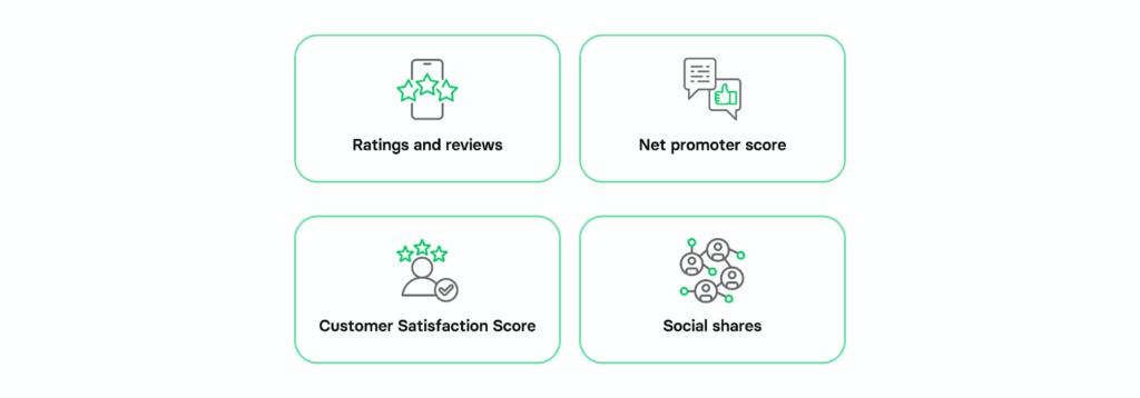
Metrics based on user feedback provide insights into user sentiments and overall satisfaction with your app design. These metrics aid in comprehending the impact of your app’s design on user emotions and expectations.
1) Ratings and reviews
Positive app store reviews from your target audience and higher average ratings contribute to better overall performance. However, it’s important to note that the number of ratings may not necessarily reflect the same level of passion or engagement as reviews, given that rating an app typically requires less effort.
How do you improve user ratings and reviews? Gather feedback, address concerns, and actively seek ways to improve the overall user experience of your app. Regularly updating the app based on user feedback can positively impact both the quantity and quality of ratings.
2) Net promoter score (NPS).
Net promoter score indicates customer loyalty and satisfaction. It boils down to one question in the survey: How likely are you to recommend this app to a friend or colleague?
Users rate this likelihood on a scale from 0 (very unlikely) to 10 (very likely). The responses are then categorized into
- Detractors: 0 to 6
- Passives: 7 to 8
- Promoters: 9 to 10
To calculate the NPS, use the formula:
Net Promoter Score = (Number of promoters – number of detractors) ÷ (number of respondents) x 100
How do you improve the net promoter score? Implement changes that resonate positively with users and address concerns promptly.
3) Customer Satisfaction Score
In CSAT (Customer Satisfaction) surveys, users are simply asked, “How satisfied are you with this app?” They rate their satisfaction on a scale from very dissatisfied to very satisfied, usually using a 5-point system. The result is expressed as a percentage, with 100 indicating the highest satisfaction. The calculation is straightforward:
CSAT = (Number of satisfied users/Number of total users surveyed) X 100
How do you improve the customer satisfaction score? Analyze common themes in negative feedback to address key pain points, ultimately refining the app based on user preferences.
4) Social shares
Take note of how often your app gets recommended or shared on social media. A higher count is favorable, but it’s equally important to examine when and where these shares happen and the context in which they occur.
How can you improve the metric of your app’s social media recommendations? Focus on creating shareable content within the app, encourage users to share their achievements or experiences, and optimize the app’s social media integration to facilitate seamless sharing. Additionally, actively engage with your target audience on social platforms to foster a community around your app.
Type 4: Revenue metrics
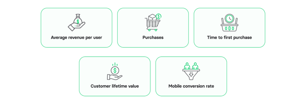
1) Average revenue per user (ARPU)
ARPU is the average amount of money generated per user through in-app purchases, ad interactions, subscriptions, paid downloads, or other ways of monetization.
Calculating average revenue per user involves dividing the total revenue generated by your app by the number of active users during a specific period.
How do you enhance ARPU? It’s important to increase user engagement. Provide incentives for in-app purchases or subscriptions. You can offer premium features and optimize monetization channels.
2) Purchases
If purchases aren’t growing or are on the decline, it’s time to reconsider your user journey or spice things up with more relevant offers through notifications and promo campaigns.
Funnel analysis works wonders for keeping an eye on in-app purchases.
3) Time to first purchase
In different industries, the time users spend making a purchase varies. If your users take longer than the industry benchmarks average, consider streamlining the checkout process.
How do you improve the metric of user purchase time? Minimize the steps users need to take from product selection to completion of the transaction. Consider implementing prompts or incentives to prompt quicker decision-making.
4) Customer lifetime value (CLV)
This metric shows the money your mobile app users have spent. The average customer lifetime value helps you figure out how loyal your user base is and how you can tailor your approach to them more effectively.
How do you improve the average customer lifetime value metric? Focus on providing personalized experiences and continuously improving your app’s features.
5) Mobile conversion rate
The conversion rate is crucial. Even if you have a massive user base, what truly counts, is the conversion rate.
To track mobile app conversions, set up events in your mobile analytics – it’s the simplest method.
How can you enhance the app conversion rate? Optimize the user journey, refine the checkout process, and address any pain points.
Mobile app metrics checklist: what to measure in your app before redesign
To decide on the most important metrics, you can access and download this checklist template in GoogleDoc format here.
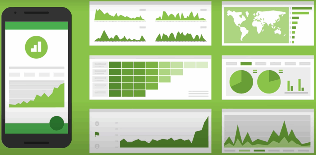
What is a customer experience dashboard & how to use it to improve app metrics
A customer experience dashboard is a visual tool that displays key metrics, helping you track and understand how customers engage with your app. This dashboard is a game-changer, allowing businesses to spot trends, assess overall customer satisfaction, identify issues, and build a well designed app.
Image source: Customer Experience Dashboard Examples
Now, let’s break down the steps to get to the core of your customers’ experiences:
Step 1. Decide what metrics to track
Start by choosing the metrics that matter. While data is vital for customer satisfaction, it’s crucial to be selective. For small businesses, focusing on too many metrics might be confusing and strain resources.
Step 2. Choose the right experience analytics tool
The right customer experience analytics tools will give you visual representations of all your KPIs in one place (you can find an overview of the best tools available in the next chapter of this article). Opt for a tool that visually represents all your metrics effectively.
Step 3. Set up your dashboard customer experience dashboard
Simplicity is key in setting up your dashboard. Ensure it is easy to navigate, simple for non-technical teams to access, and visually represents the chosen metrics effectively.
Step 4. Monitor your app performance metrics
With your dashboard up and running, regularly monitor your metrics over time. Visual aids like graphs and charts make this process easier, providing a clearer picture of trends and patterns.
Step 5. Analyze the data
Delve into data analysis using your customer experience dashboard, breaking down various stages of your customers’ journeys. Identify factors influencing the customer experience and focus on critical events like rage taps and drop-offs.
Step 6. Take action
Having analyzed your data, take actionable steps to address identified issues. Your mobile app redesign process should incorporate all the insights gathered. For instance, if a button is problematic, watch session replays to understand the issue and make necessary adjustments.
Step 7. Continuously improve
Embrace a mindset of continuous improvement. Refine based on new insights and data. This iterative process ensures that your business remains attuned to customer needs.
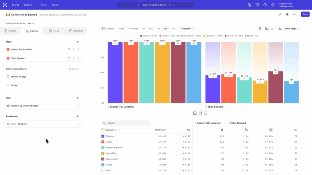
Monitoring app performance metrics: 8 best customer analytics tools
Here are some of the top customer analytics tools you can use to monitor your app metrics:
1) UXCam
UXCam automatically tracks and records every customer action in your mobile app. You can use heat maps to view specific touchpoints and identify any issues within your app and session replays to look at how users interact with your app to complete their objectives, identifying any bottlenecks they experience along the way.
2) Amplitude
Amplitude provides comprehensive product analytics, allowing you to understand user behavior, measure engagement, and make data-driven decisions to enhance your app’s performance.
3) Google Analytics for Mobile Apps
Google Analytics offers in-depth web and app analytics, helping you track user interactions, monitor traffic sources, and gain insights into user demographics and preferences for informed mobile app redesign decisions.
4) Mixpanel
Mixpanel focuses on user engagement analytics, enabling you to track events, analyze user journeys, and measure the impact of feature changes to optimize your app’s user experience.
5) Woopra

Woopra offers real-time analytics that allows you to track user behavior, understand customer journeys, and personalize user experiences to ensure a seamless and tailored mobile app redesign.
6) GainSight
GainSight provides valuable customer-centric metrics, offering insights into user engagement, satisfaction, and behavior, making it an essential experience analytics tool for informed decisions in the app redesign process.
7) ChurnZero
ChurnZero provides insights into customer churn, helping identify areas for improvement in user experience, and aiding in successful redesign.
8) Glassbox

Glassbox helps discover exactly what your customers do, and why. You can create frictionless customer journeys, understand user struggles, and optimize every step.
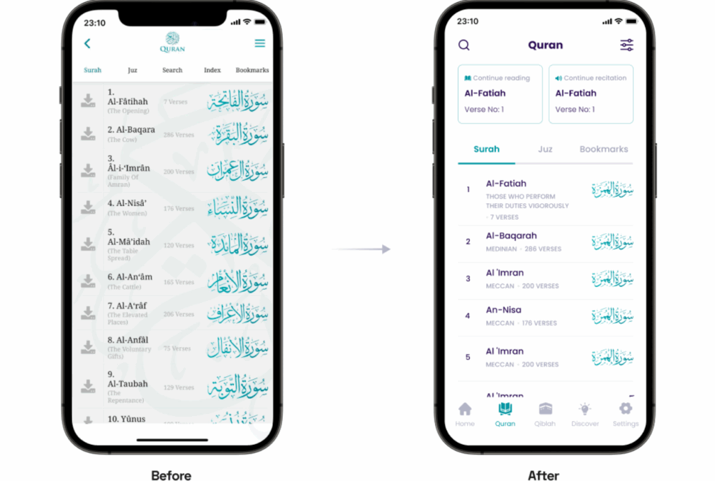
Our experience: how Volpis improves metrics of products (recent mobile app redesign project)

At Volpis, we’ve had the privilege of working with some of the biggest names in the industry to enhance their apps’ user experiences, and now, we’re ready to bring that expertise to your application.
For instance, our recent collaboration with a popular non-profit mobile app for Android and iOS The Holy Quran resulted in a remarkable increase in the app’s rating from 4.3 to an impressive 4.8, accompanied by the achievement of surpassing 1 million downloads.
About the project: The journey with The Holy Quran app began a few years ago when the app needed substantial maintenance and improvements. In 2022, we kicked off the most intense phase of our partnership: app redesign. The goal was to modernize every aspect of the UX and UI. Redesigning The Holy Quran app presented several significant challenges that needed immediate attention:
Challenge 1: Complex UX flows hindering user navigation and feature access
Solution: We conducted user research, simplified and streamlined complex UX flows, introducing intuitive navigation and enhancing feature accessibility.
Challenge 2: Outdated design lacking modern aesthetics
Solution: Our team revamped the design, incorporating modern design trends and aesthetics while preserving corporate branding. This ensured a seamless transition, maintaining brand identity with contemporary visual elements and user-friendly interfaces.
Challenge 3: Obsolete technologies affecting app stability, security, and maintainability
Solution: We conducted a comprehensive technological overhaul, replacing obsolete technologies with modern, secure frameworks. This not only enhanced the app’s stability and security but also ensured long-term viability and easy maintenance.
A detailed exploration of this app redesign journey with a detailed account of each phase (and the strategic decisions made) can be found here.
Do you want to improve the performance metrics of your app and consider redesigning it?
Consistently acknowledged as one of the top app development companies on Clutch, Volpis can help you enhance the performance metrics of your app.
Whether you’re at the initial stages of considering a redesign or have specific questions about the potential improvements for your app, we welcome any inquiries. Feel free to contact us via email at info@volpis.com or connect with us on LinkedIn.
Questions & Answers
FAQ
On what metrics would you judge the success of that particular application?
To gauge the success of a particular application, metrics such as task success rate and net promoter score are critical. By monitoring these and other metrics that were described in the article, you can assess how effectively the app meets user needs and performs in terms of both functionality and user satisfaction.
When should you redesign an app?
A redesign strategy should be initiated when key metrics indicate a need for improvement, ensuring the redesigned app is visually appealing and aligned with evolving user expectations.
What are metrics in design?
Metrics in app design encompass data-driven indicators used to evaluate the performance and impact of UI elements.
How do I redesign an existing app?
To embark on a successful mobile app redesign process, start by conducting thorough user research to identify pain points, user engagement levels, and areas ripe for improvement. Engage a skilled design team to revamp key features, making the design visually appealing and addressing any challenges that have led to a poor user experience. Redesigning an existing app may seem like a daunting task, but with a well-executed app design revamp, you can transform it into a platform that keeps users engaged and satisfied.