Are you seeking ways to boost your mobile app’s conversion rate and considering a redesign?
The design of a mobile app goes beyond visual appeal; it’s a key driver of user engagement, and it can make or break your app’s success.
Our design team at Volpis has assisted many businesses in redesigning their mobile apps to enhance conversions and overall success, and now we want to share the insights we’ve gained over the years.
Let’s explore some of the most powerful ways to optimize your mobile app design for increased conversions.
What is the mobile app conversion rate?
The mobile app conversion rate is a metric that quantifies the number of users who successfully complete desired actions, such as making in app purchases, signing up, or engaging with content. This measurement offers valuable insights into the app’s performance and user satisfaction levels.
The user actions (aka conversion events) vary from industry to industry. The table below shows actions for various app categories that act as conversion points.
| App category | Conversion events | Example apps |
| E-commerce | Purchases, сart additions, sign-ups | Amazon, Shopify, eBay |
| Social Media | Profile creations, content shares | Facebook, Instagram, Twitter |
| Fitness | Subscription sign-ups, workouts | MyFitnessPal, Nike Training Club |
| Travel | Bookings, itinerary creations | Airbnb, Expedia |
| Finance | Account registrations, transactions | Payoneer, PayPal |
How to calculate the mobile app conversion rate?
Calculating the mobile app conversion rate involves using the following formula:
Conversion rate = (Conversions/Total visitors) X 100.
For example, if your app had 100 downloads and 10 users made a purchase, your conversion rate would be 10%.
And what is an ideal mobile app conversion rate? While there isn’t a universally perfect figure, experts generally consider a standard conversion rate for mobile applications to fall within the range of 1% to 3%.
For instance, in October 2022, the conversion rates for Android across all mobile app categories were approximately 2.57 percent. Moving into the first months of 2023, app conversions increased, reaching 2.95 percent.
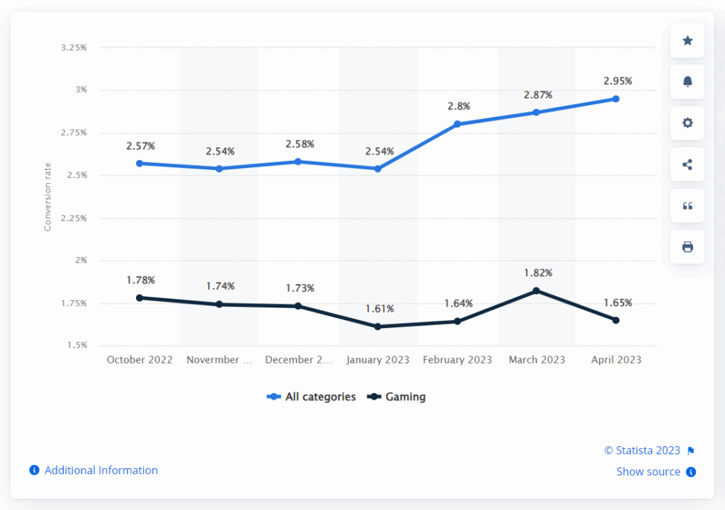
Mobile Android subscription app conversion rate worldwide from October 2022 to April 2023
But how can you increase mobile app conversion rate? By identifying and addressing pain points in the user journey, redesign can eliminate obstacles that might deter users from completing desired actions. A well-executed app redesign can transform your platform into a conversion-friendly environment.
Top proven strategies for boosting mobile app conversion rate: how to increase conversion rate with mobile app redesign
If you’re considering redesigning your mobile app to improve the app conversion rate, there’s no room for guesswork. Let’s take a look at tactics that have stood the test of time.
1) Create a clear in-app funnel (the path to conversion on the mobile app)
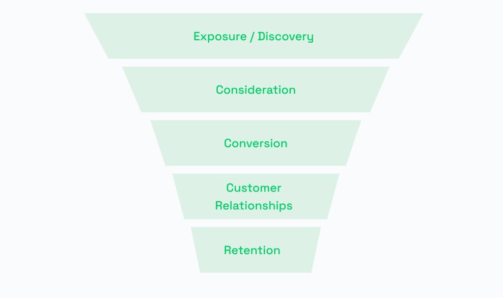
It is crucial to have a comprehensive understanding of the in-app funnel to identify improvements that need to be implemented.
The mobile app funnel is a five-stage journey, outlining the path users take from the moment they learn about your app to becoming loyal customers:
- Stage 1: Discovery
- Stage 2: Consideration
- Stage 3: Conversion
- Stage 4: Customer relationships
- Stage 5: Retention
Analyze user behavior at each step. Identify drop-off points and areas where users might abandon the app. With a clear understanding of the funnel, you can precisely target areas that need optimization, be it refining the onboarding process, enhancing mobile app conversion mechanisms, or nurturing post-conversion relationships.
2) Perform UX research to understand app users and factors that influence conversion rate

Examine user journeys, navigation patterns, and the features they engage with the most.
Tools like user personas, journey maps, and usability testing can provide insights into what users truly want and how they interact with the app, leading to design decisions that resonate with the target audience.
Developing detailed user personas that represent archetypal users helps in creating a user-centric design by aligning decisions with the needs and preferences of specific user segments.
3) Implement analytics tools to identify friction points in your user journey
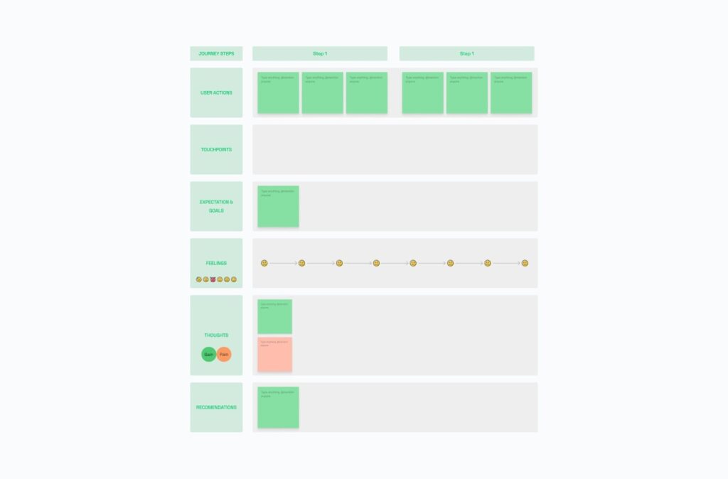
Using analytics tools such as Google Analytics or Flurry will allow tracking user interactions within your app.
Heatmaps, user flow analysis, and session recordings can pinpoint specific areas where your app users may encounter difficulties, allowing for targeted improvements.
4) Streamline onboarding and eliminate bottlenecks that undermine your mobile app conversion rate
Implementing effective onboarding techniques facilitates a smoother and more user-friendly introduction to the app.
| Technique | Description | Example |
| User onboarding flow | Design a seamless step-by-step process guiding users through key features and functionalities. | App welcome wizard |
| Personalized welcome | Offer personalized greetings and relevant information to create a tailored onboarding experience. | Customized user greeting |
| Interactive tutorials | Provide hands-on tutorials or walkthroughs to help users quickly grasp how to use the app effectively. | In-app guided tour |
| Progressive profiling | Gather user information gradually, minimizing overwhelming data entry during initial onboarding. | Profile completion stages |
| Clear call-to-action | Clearly indicate the next steps users should take, ensuring a smooth transition from onboarding to app usage. | “Get started” button |
5) Simplify a user’s path to conversion
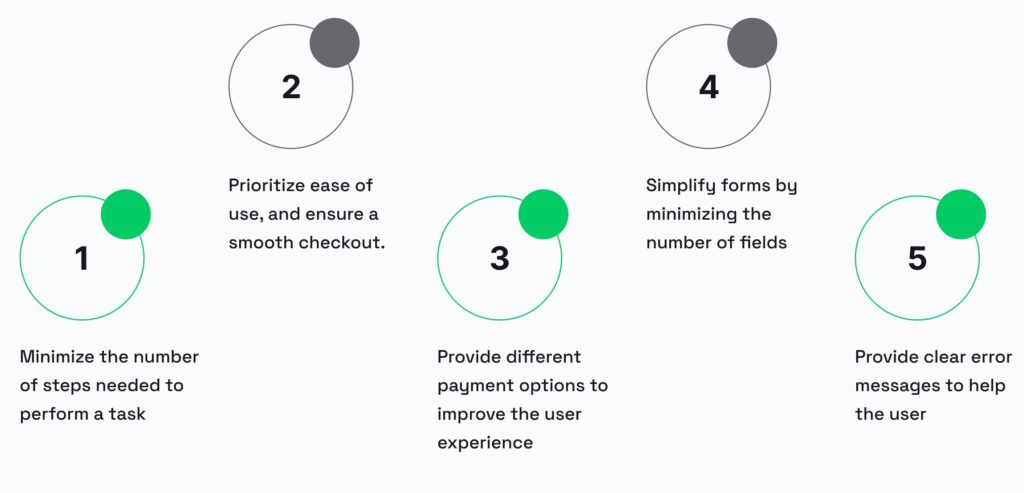
Minimize the number of steps needed to perform a task or a transaction. Prioritize ease of use, and ensure a smooth checkout. But keep in mind the latest trends to ensure that your product remains relevant, competitive, and aligned with the evolving expectations of users.
Providing a variety of payment options caters to a wider range of user preferences, enhancing the user experience at the point of purchase. This includes integrating different payment gateways and clearly communicating available payment methods.
Simplifying forms by minimizing the number of fields can significantly enhance user experience. Incorporating predictive text and auto-fill options can further streamline the form-filling process. Additionally, providing clear error messages can help users correct mistakes easily and reduce frustration.
6) Incorporate persuasive elements
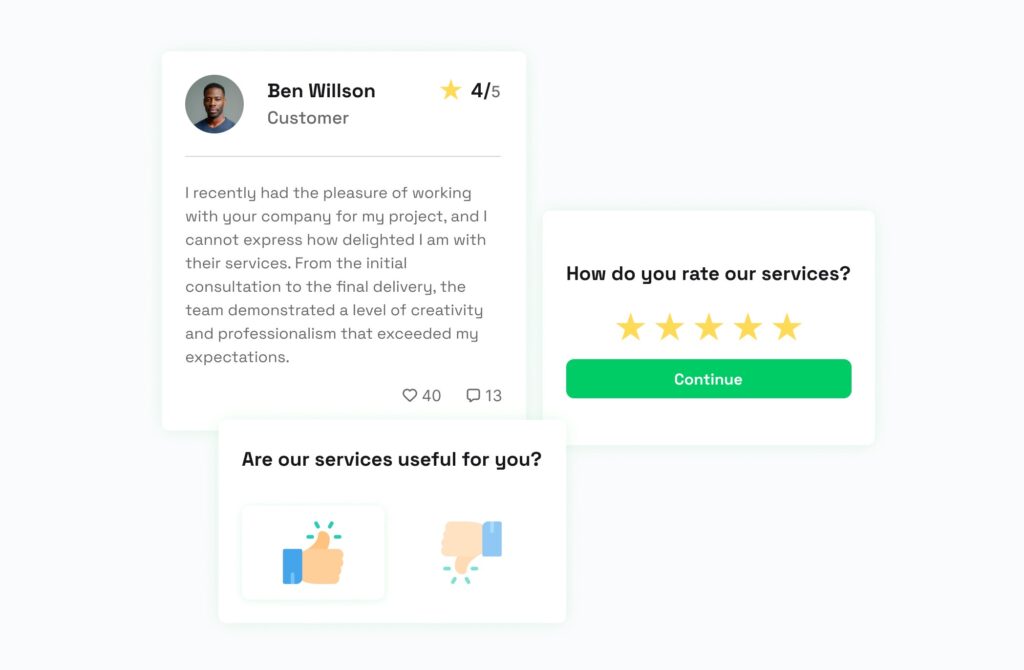
Leveraging testimonials, social proof, ratings, reviews, and incentives taps into human psychology, fostering a sense of trust, and thereby influencing user behavior positively.
Also, leveraging the FOMO (Fear of Missing Out) strategy can be particularly effective by creating a sense of urgency and exclusivity.
7) Add attention-grabbing call-to-action elements
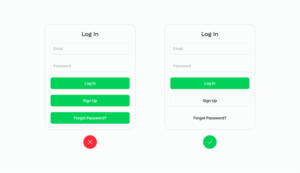
Incorporating visually compelling and strategically positioned prompts or buttons helps to capture users’ attention. Ensuring clear primary and secondary button distinction is crucial for providing users with intuitive navigation, reducing confusion, and guiding them toward the desired actions on the interface.
A clear and compelling CTA is vital for guiding users toward desired actions. This includes using persuasive language that encourages action and employing contrasting colors to make the CTA stand out. The positioning of the CTA also plays a significant role; placing it where users naturally finish consuming content can lead to higher engagement rates.
8) Use color psychology and emotional UI/UX principles
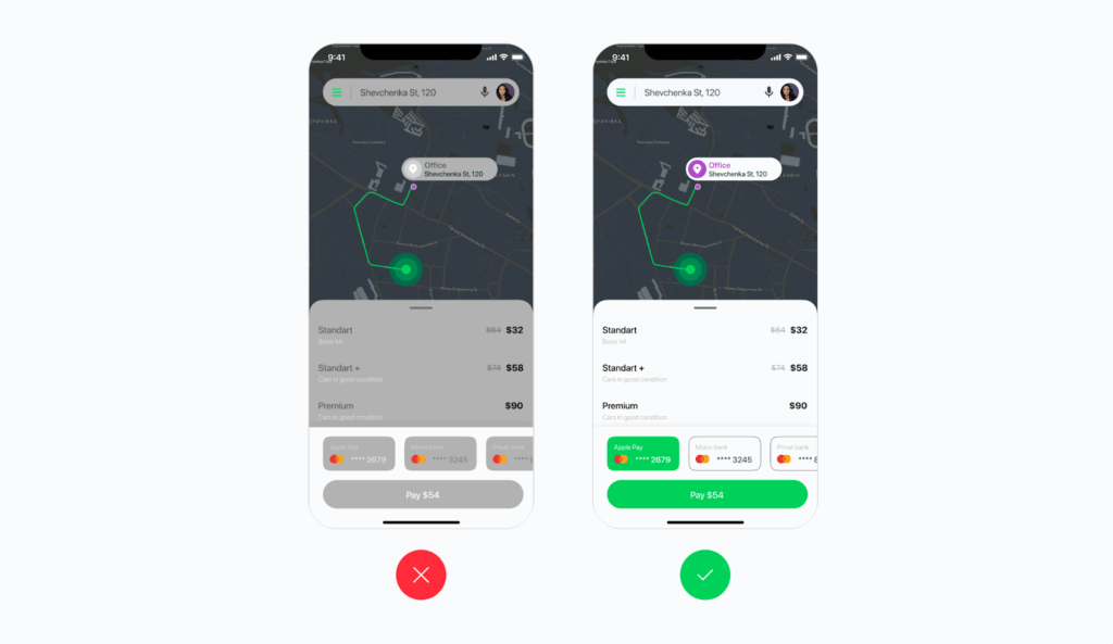
By utilizing hues, tones, and design elements that resonate with users on an emotional level, you can evoke positive feelings and enhance the overall perception of your app, contributing to more engaging and enjoyable user interaction.
The color scheme of an app plays a crucial role in its aesthetic appeal and usability. Choosing a color palette that is pleasing to the eye and suitable for all users, including those with visual impairments, is essential. High contrast between text and backgrounds enhances readability and accessibility.
9) Optimize the app for different mobile devices, platforms, and screen sizes
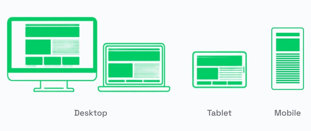
It’s important to ensure seamless functionality across various devices, platforms, and screen sizes.
Design the app interface to accommodate all supported devices, be it iOS, Android, Tizen, Microsoft, KaiOS, and so forth. And conduct thorough testing to ensure that there are no issues.
10) Improve social integration
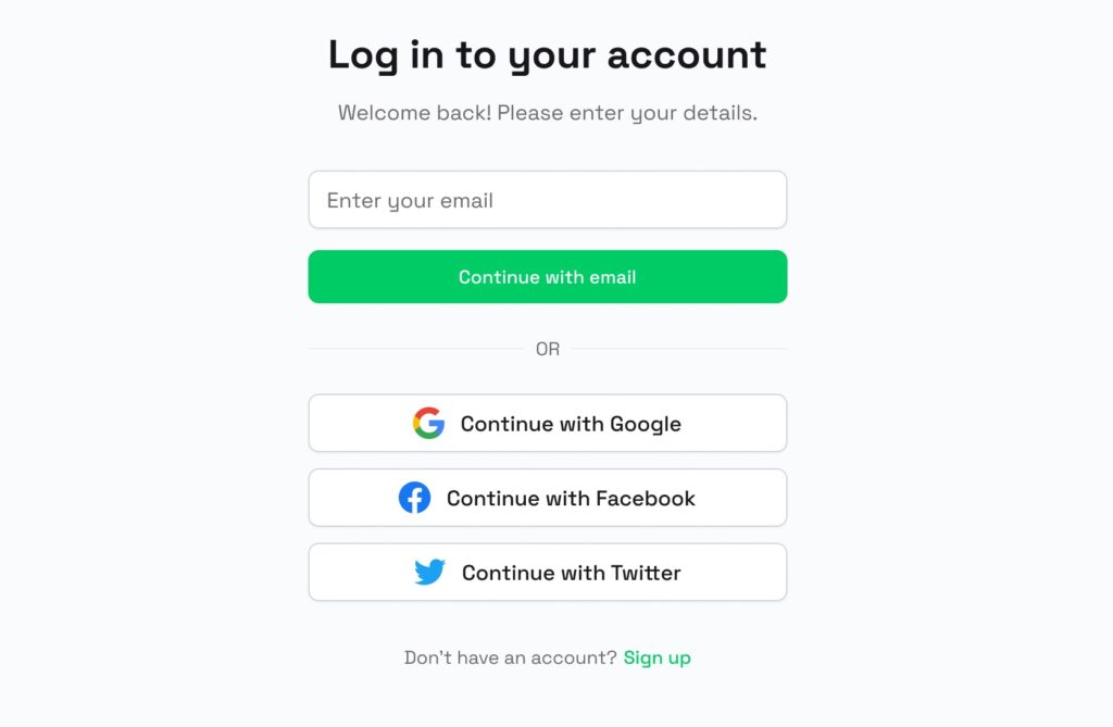
This may include enabling users to seamlessly share content, connect with friends, or log in using social media credentials.
For example, enabling social logins could streamline the onboarding process. And enabling users to share achievements, updates, or interesting content directly from your app could create an interactive user experience, potentially attracting a wider audience through social networks.
11) Ensure readability
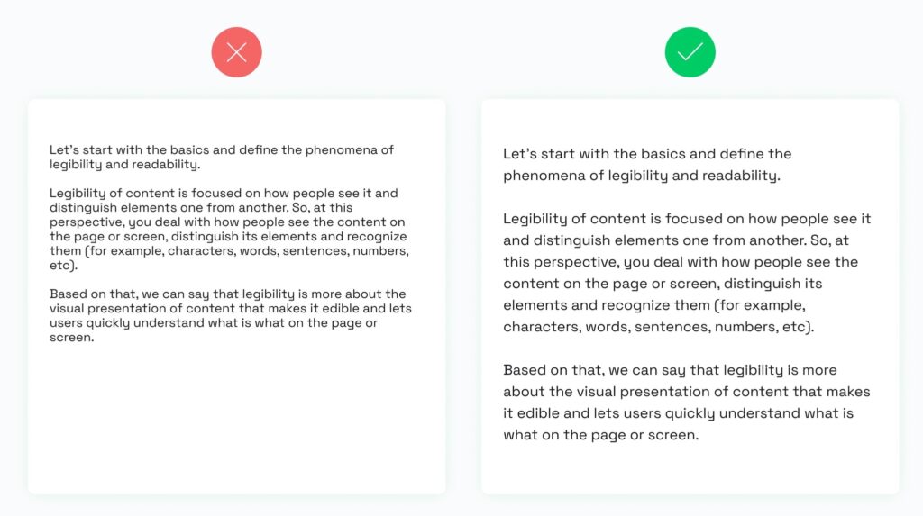
Another crucial aspect is ensuring readability, especially on small mobile screens. Opt for fonts that are easy to read and conduct tests under different lighting conditions to ensure that the text remains legible in various environments.
Ensure sufficient contrast between text and background colors. Break content into concise paragraphs to prevent overwhelming blocks of text. Avoid overly decorative fonts that may hinder readability and color combinations that may strain the eyes.
12) Avoid intrusive pop-ups

While push notifications can be a useful tool for engaging users, they should be used sparingly and strategically.
Timing them appropriately based on user interaction and ensuring they provide relevant and beneficial information is crucial. The design of push notifications should allow for easy dismissal to avoid disrupting the user experience.
13) Create an intuitive user interface (UI)
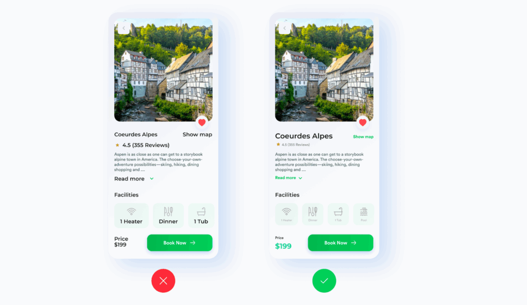
Maintain uniformity in app’s UI elements by employing mobile-friendly fonts, contrast, alignment, iconography, and proper text hierarchy. Using white space effectively can help in creating a clean and uncluttered interface. This not only beautifies the design but also directs users’ attention to key elements.
A well-thought-out visual hierarchy guides the user’s attention to key information. This can be achieved by using different sizes, colors, and layouts to highlight important elements like headlines, CTAs, or features. The goal is to create a logical flow that naturally draws the user’s eye through the app, making information consumption intuitive and effortless.
14) Provide a coherent user experience (UX): simplify navigation and align design with user needs

Tailor the design to suit the target audience, applying the 80/20 law: prioritize 80% efficiency and 20% enjoyment. Focus on intuitive navigation and information architecture to eliminate any friction in the user experience, thus encouraging more mobile app conversions.
To improve user experience, simplifying navigation is crucial. This involves reducing the complexity of the menu and organizing it in a way that feels natural to the user. Utilizing familiar icons and menu structures can greatly enhance UX. For example, you can use a house icon for the home page or a magnifying glass for the search function. The goal is to allow users to navigate the app with minimal effort and confusion, ideally finding what they need within a few taps.
15) Ensure accessibility

Designing an app with accessibility in mind means considering users with various disabilities. This includes incorporating features like screen readers, alternative text for images, and voice control options.
Adhering to accessibility standards ensures that the app is usable by a diverse audience.
16) Iterate based on user feedback
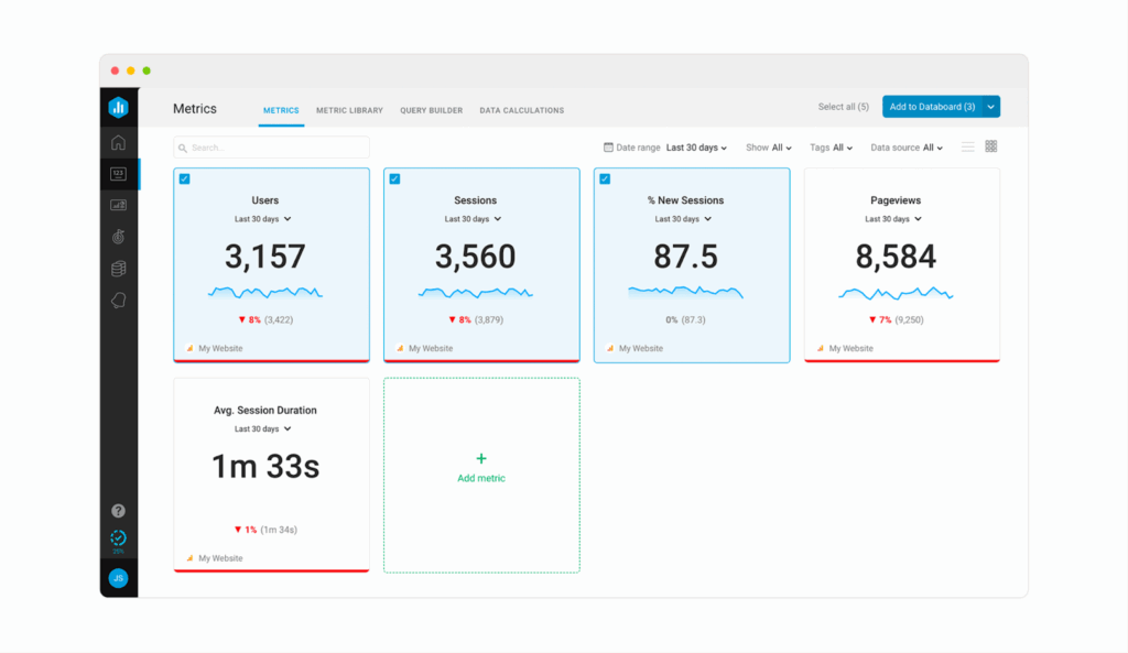
Gather feedback from your users to acquire data for evaluating the impact on the mobile app conversion rate. Actively seeking user reviews and surveys helps in understanding their needs and preferences, allowing for informed updates that enhance the app’s functionality and user experience. This not only improves current user satisfaction but also attracts new users by demonstrating a commitment to user-centered mobile app development.
Post-redesign, it is essential to monitor metrics such as user engagement time, bounce rate, click-through rates on CTAs, and, notably, the conversion rate. You can utilize tools like Google Analytics, heatmaps, and A/B testing to gather valuable insights into user interaction and satisfaction.
Understanding user psychology: factors that influence mobile app conversion rate

Improving the UI and UX design of your mobile application can elevate various aspects that prompt positive decision-making. These factors include:
App speed & performance
A well-optimized and fast-performing app enhances user satisfaction, contributing to positive decision-making
Navigation & information architecture
An easily navigable app with clear information architecture reduces cognitive load, fostering a seamless user experience and positively impacting the conversion rate.
Engaging UX copy
Well-crafted copy that resonates with users emotionally or compelling app descriptions that address their pain points attract more users, keep existing users engaged, and encourage mobile app conversions.
Visual hierarchy & CTA placement
A well-defined visual hierarchy and strategically placed CTAs guide mobile app users through the desired actions, increasing the likelihood of conversions.
Social proofs & testimonials
Positive reviews and testimonials motivate potential users to make favorable decisions and engage more actively with the app.
Personalized & targeted recommendations
Tailoring recommendations to individual users’ needs and preferences ensures a more engaging experience, fostering a deeper connection with the app.
Top 8 reasons to redesign your mobile app
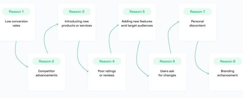
But does your mobile app truly require a redesign, or maybe the current version effectively meets your goals? Consider these main reasons that often indicate when a mobile app overhaul might be beneficial:
Low conversion rates
If your mobile app struggles to convert users into customers or fulfill its intended purpose.
Competitor advancements
When competitors’ mobile apps outperform yours, it’s a clear sign that a redesign may be necessary to stay competitive.
Introducing new products or services
A redesign is essential when launching new offerings to align the app with evolving business objectives.
Poor ratings or reviews
Declining ratings or negative reviews signal the need for a revamp to address user concerns and improve overall satisfaction.
Adding new features and target audiences
To accommodate new features or reach additional target audiences, a redesign can enhance functionality and appeal.
Users ask for changes
When users consistently request changes or improvements, it’s a strong indicator that a redesign is needed to meet user expectations.
Personal discontent
If you, as the app owner, are dissatisfied with its current state, a redesign can align the app more closely with your vision and preferences.
Branding enhancement
A redesign is warranted to align the app’s visual elements with improved branding strategies, ensuring a cohesive and impactful brand representation.
How redesign increases mobile app conversion rate
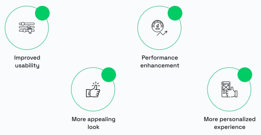
A well-executed redesign can create a comprehensive and positive transformation, ultimately contributing to heightened mobile conversion rates and user satisfaction.
1) Improved usability
An overly complex design can overwhelm users, leading to a poor experience. Limiting the number of choices and actions on each screen helps reduce cognitive load, making the app easier to use and navigate. A balanced approach to design elements and content is essential for an engaging yet straightforward user interface.
2) More appealing look
Consistent branding across all visual and textual elements of the app reinforces brand identity. This includes using consistent colors, fonts, and logos. Ensuring that all elements of the app align with the brand’s style guide creates a cohesive and recognizable brand experience for the user.
3) Performance enhancement
Redesigned mobile apps often come with performance improvements, addressing factors such as optimized speed and functionality. Users benefit from faster loading times, smoother transitions, and a reduction in glitches or errors. The focus on performance enhancement is instrumental in elevating user engagement and overall trust in the app’s functionality.
4) More personalized experience
A successful redesign goes beyond aesthetics and usability to deliver a more personalized experience. By adopting user-centric design principles and incorporating customization features, the redesigned app aligns with individual user preferences and behaviors. This personalization fosters a stronger connection between users and the app, increasing engagement and loyalty over time.
Examples of how mobile app redesign increased the conversion rate: Instagram and Uber redesign case studies
Examining successful case studies unveils the transformative impact that mobile app redesigns can have on conversion rates. Let’s take a look at notable examples that showcase how strategic redesigns have not only revitalized user experiences but also significantly boosted conversion rates, setting a compelling precedent for the industry.
1) Instagram redesign case study
Objective: Instagram aimed to improve user engagement and navigation efficiency with its redesign, focusing on a more streamlined and visually appealing interface.
Changes implemented: Instagram revamped its homepage by relocating icons for improved accessibility. Notably, Reels has been centered, replacing the icon for creating posts, while the ‘+’ icon and ‘heart’ button find their new positions at the top right. The ‘Shop’ tab now occupies the former location of the ‘heart’ button at the bottom of the page, coinciding with Instagram’s plans to incorporate ads into Reels clips.
Outcome: The Instagram redesign resulted in increased user satisfaction, elevated user engagement metrics, and a positive response from the user community.

2) Uber redesign case study
Objective: Uber’s redesign aimed to improve overall user experience and address user feedback by introducing a more user-friendly interface.
Changes implemented: The redesign involved simplifying the app’s navigation, refining the booking process, and making it easier for app users to access key features and information.
Outcome: The Uber redesign resulted in a more intuitive and efficient app, reducing user friction, increasing driver-partner engagement, and contributing to a more seamless and enjoyable ride-hailing experience.

Enhancement in conversion rate: case study on how Volpis helps businesses boost conversions through app redesign
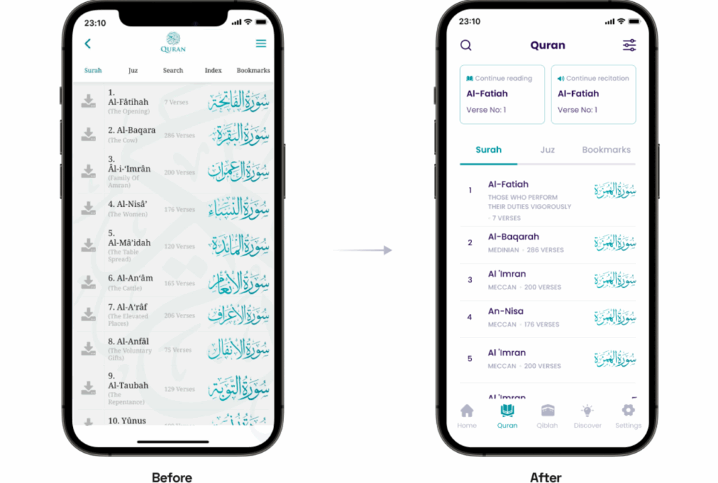
Leveraging our extensive experience, Volpis has collaborated with industry leaders to enhance user experiences and conversion rates. For example, recently our team redesigned a popular non-profit mobile app for Android and iOS, The Holy Quran. The app has become a trusted resource for the Muslim community and those interested in Islam.
We effectively raised the app rating from 4.3 to 4.7, reaching a significant milestone by surpassing 1 million downloads. Further details about this redesign journey can be explored here.
Do you need to redesign your mobile app to increase conversions and boost sales?
Consistently recognized as one of the top custom app development companies on Clutch, Volpis has crafted more than 100 tailored web and mobile applications for our esteemed clients.
If you’re planning to redesign your app, we’d love to answer any questions you may have. You can contact us via email at info@volpis.com or connect with us on LinkedIn.
Questions & Answers
FAQ
How do I increase my mobile app conversion rate?
To boost your mobile app conversion rates, consider optimizing your app’s UI to create a compelling user interface that engages mobile users effectively. When you target specific user groups with tailored in-app funnels and encourage users through strategic call-to-action elements, it can significantly increase your mobile app purchases and ultimately boost your app conversion rate.
Why is app redesign important?
App redesign is crucial for several reasons, with one key factor being the potential to increase the mobile app conversion rate. A well-executed redesign can optimize loading speed, improve app engagement, and entice both new and existing users through enhanced user interfaces so you can stay competitive in app stores like Google Play.
What is the conversion rate of a mobile app?
Mobile app conversion rate is the percentage of users who complete desired conversion event, such as in-app purchases or sign-up forms. Understanding and monitoring this metric is essential for mobile application owners and app developers aiming to increase their app’s conversion rate and drive more engagement among mobile users.
How does UX affect conversion rate?
User experience (UX) is a critical factor influencing the mobile conversion rate of a mobile app. A well-crafted UX positively impacts the user journey and encourages users to complete conversion event, thereby boosting the app’s overall conversion rate.
What influences conversion rates?
Several factors influence mobile app conversion rates, including engaging in-app funnels and personalized recommendations. Targeting specific user groups, optimizing loading speed, and utilizing push notifications strategically all play key roles in influencing user decisions and ultimately driving higher mobile app conversion rates.
What makes a good mobile app design?
A good mobile app design incorporates key UI/UX principles, including an optimized UI, and effective call-to-action elements.
What are the most important mobile UI/UX design principles that boost in-app conversions?
The most important mobile UI/UX design principles for boosting in-app conversions include employing effective call-to-action buttons and ensuring seamless sign-up forms.
What drives a high conversion rate?
A high mobile app conversion rate is driven by a comprehensive approach that includes a well-optimized UI/UX. Implementing split testing tools, implementing robust product and marketing strategies, leveraging social media platforms integrations, and refining payment processes are fundamental components in achieving and sustaining a high mobile conversion rate over time.


