Did you know that according to research, every $1 invested in UX results in a return of $100?
By fixing usability issues, you can significantly boost your app revenue, ratings, retention rate, and so much more.
In this article, we want to share the insights our design team has gained over the past 10 years, including an effective process for identifying and fixing app design (aka usability) issues, as well as the most common mobile app usability problems and how to eliminate them.
And if you need to enhance your product’s user experience, you can always reach out to us via info@volpis.com with any questions and concerns.
How to identify and fix app design issues: step-by-step process
To assess usability in mobile apps, you require data. Begin by installing a mobile analytics tool in your app. For example, it can reveal which pages lead users to abandon tasks. Analytics offer unbiased data, providing clear insights into user behavior.
Step 1: Implement analytics
Start by installing a mobile analytics tool such as Google Analytics for Mobile Apps, UXCam, Mixpanel, or another similar tool. This will allow you to collect data about how your mobile app is performing and keep track of all the events within it. Ensure that the solution you select can track the following data:
- Number of new and returning users
- Number of sessions and session duration
- Frequency of app usage
- Number of glitches (bugs) in the app
- Characteristics of your target audience (gender, age, language, location)
- App version and compatible devices
- In-app events
- Screen navigation
Step 2: Collect and analyze data
Understanding how users navigate through your mobile application is essential for improving its usability. Utilizing a mobile analytics tool provides valuable insights into user interactions, aiding in the detection of usability issues. And to effectively utilize this data, start by examining your app’s information architecture and thoroughly analyzing the typical paths users take. Pay close attention to screens where users tend to abandon the app. Identify potential reasons for this behavior. Is it because the app doesn’t address their needs? Are they having trouble navigating it? Are there frequent crashes?
Although much of this process involves hypothesizing, you can come up with different versions of user behavior based on screen usability patterns. For example, in a shopping app, users might leave the product description page due to:
- insufficient information,
- difficulty adding items to the cart,
- competitive pricing elsewhere.
To find the exact root causes, you’ll need to conduct usability testing across different scenarios and gather user feedback to understand the user’s perspective. To ensure its success, it’s essential to develop accurate end user personas and use cases that represent your target audience effectively.
Step 3: Create personas and use cases
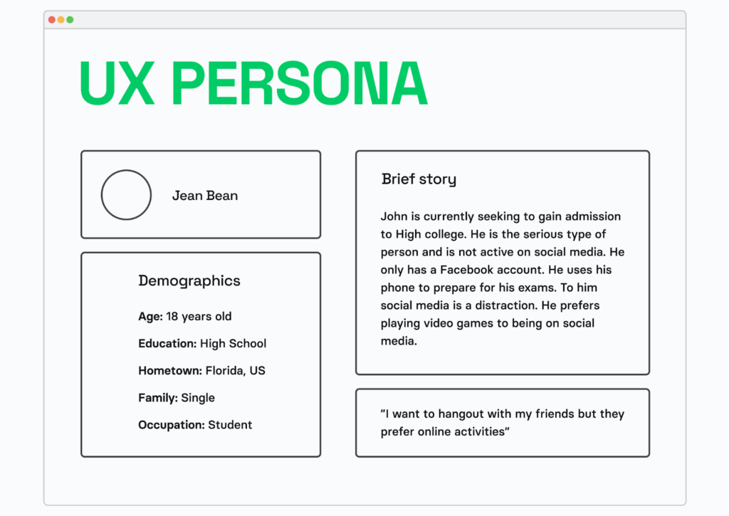
To effectively address app design issues, it’s crucial to understand your target audience. While data analysis helps identify problematic app screens, personas provide a broader context.
A persona is a representation of a target group of customers, outlining their goals, habits, and motives that drive user behavior.
Use cases depict how personas (users) engage with the app. These scenarios are based on personas’ goals, actions to achieve those goals, and the overall context. For instance, here is a typical use case for an eCommerce app:
1. Open the app.
2. Enter search criteria to find a desired item.
3. Browse through search results to find the desired item.
4. Read product information.
5. Review customers’ feedback.
6. Place an order.
7. Receive a confirmation email with shipping details.
Although use cases may seem straightforward, they are crucial for architects, designers, and QA engineers in ensuring the app’s functionality and optimal user experience.
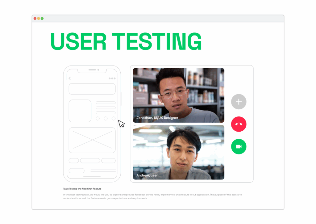
Step 4: Test your app on real people (conduct usability testing)
Now that you’ve gathered all your data, crafted personas, and created use cases, it’s time to test your app’s usability. Here’s what you’ll need to do:
1. Gather a group of individuals who represent your personas.
2. Create clear instructions to guide testers through various scenarios.
3. Observe how they interact with your app.
During usability testing, a researcher follows users as they navigate through tasks on your app. This allows to pinpoint areas where users encounter issues, make mistakes, or feel lost.
To streamline this process, you can create app usability checklists and distribute them to your testing group beforehand. A basic checklist should cover:
- Goal completion: can users successfully achieve their objectives?
- Difficulty level: how challenging is it for users to accomplish their goals?
- Time spent: how much time does it take for users to complete tasks?
A small group of three to five testers is typically sufficient to gauge if your potential customers understand your app’s logic and usability. They’ll help you assess if processes like ordering are intuitive, account creation is straightforward, and if users perceive your app as suitable for regular use.
After testing is complete, gather and analyze the data to assess alignment between your goals and user experiences. Identify any bottlenecks and determine whether they stem from architectural or design shortcomings.
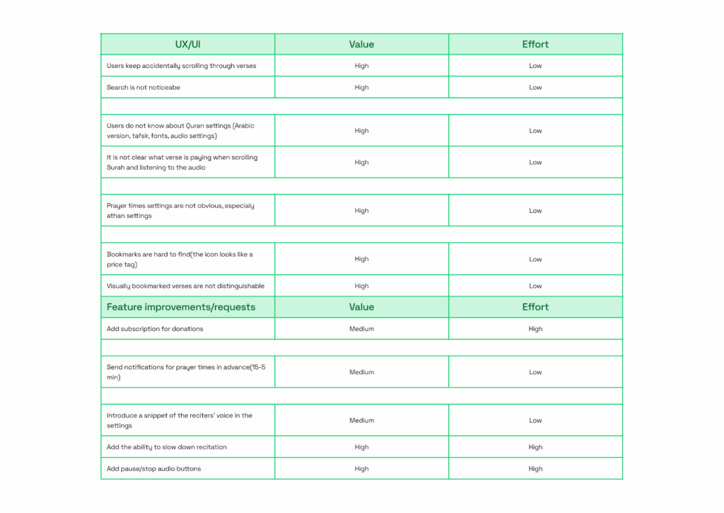
Step 5: Prioritize and categorize the bugs
After identifying all the areas causing difficulties for users, it’s important to prioritize the solutions. This can be done by placing all the issues on a value/effort prioritization matrix. This helps determine what needs immediate attention and what can wait.
Step 6: Implement and test all the fixes
Once design issues are prioritized, it’s crucial to test the app again to ensure the fixes work as intended and don’t create new problems. Testing should be done during the design stage. Testing tools like Figma’s clickable prototype functionality can assist in this process.
Incorporating thorough testing at every stage of the mobile app redesign process helps uncover and address potential UX issues before they impact the final product’s usability.
Step 7: Coding
After that, developers can implement the fixes and ensure they seamlessly integrate with the app’s code. Developers need to write clean, efficient code that addresses the identified issues while maintaining the overall stability of the app.
Most common mobile app usability issues and how to fix them
When it comes to mobile app usability, several factors can affect how efficiently and effectively users can achieve their goals. Here are some of the most common issues apps encounter:
Issue 1: Poorly executed user onboarding
First time users often need guidance to understand how to use your app effectively. Since every app is unique in layout and features, they require a walkthrough of features, known as user onboarding.
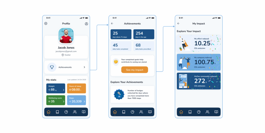
Ensuring your user onboarding is well-executed is crucial. For instance, consider the registration & profile sections of the MyDay app developed by Volpis for our customer. Upon registration, users create their personal well-being plan, prioritizing five pillars of well-being: How you Feel, How you Eat, How you Connect, and How you Move. They also select their motivation and set availability for well-being activities. Later, users can track their achievements on the Home page.
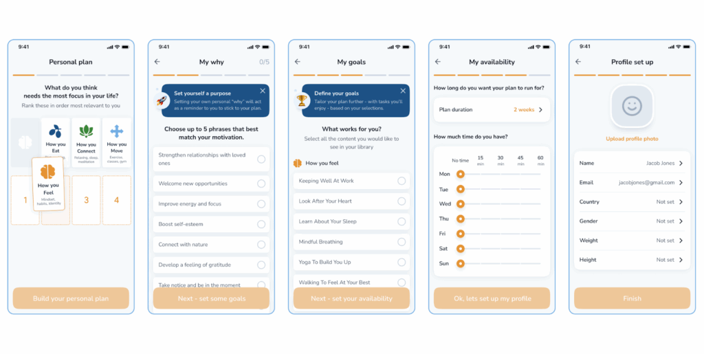
The text on the initial screens gently reminds users of the app’s benefits, encouraging people to stick with it.
Moreover, the user experience flows smoothly. You’ll know precisely which buttons to tap to navigate through the app.
Keep in mind, that while it’s essential to educate users, avoid overwhelming them. Let users learn by interacting with the app.
Issue 2: Cluttered screens (information overload)
When your app’s screen is overcrowded with visual elements, it overwhelms users. This clutter can confuse users, making it hard for them to understand the app’s features. To address this, it’s crucial to plan the app’s information architecture carefully to ensure that users receive the right information when they need it.
One effective strategy to tackle clutter is progressive disclosure. This approach involves showing only the necessary information to users at any given time. As users interact with the app, additional options that were previously hidden gradually become visible. Here’s a classic example of progressive disclosure:
Issue 3: Confusing navigation
Your mobile app should be easy to navigate. You want users to effortlessly move between screens, from the home page to their profile and beyond. If users struggle to find what they’re looking for, they’ll likely get frustrated and might abandon the app altogether.
For instance, here’s an example of a straightforward navigation setup:
This screen uses a bottom tab bar, which is a common navigation element in mobile apps. It’s similar to what you see on Instagram and Facebook. Most users are familiar with bottom tab bars and find them easy to use since they’ve encountered them before. They can quickly understand how to navigate using it and predict its functions.
Additionally, if you examine the navigation bar closely, you’ll notice that the Goals icon is highlighted in orange. This communicates to the user that they are currently on the Goals screen. The design of the screen helps ensure people always know which page they’re viewing.
Issue 4: Inappropriately sized functional elements
Struggling to read tiny text or tapping on minuscule buttons with no response can be incredibly frustrating. To address this, consider the size of a human fingertip when designing your app’s elements.
According to Web Content Accessibility Guidelines (WCAG), mobile buttons should be at least 9x9mm to ensure usability across different devices and screen resolutions.
Also, it’s important to ensure there’s adequate spacing between your buttons. If they’re too close together, users aiming to interact with one element might inadvertently activate another.
Research on button size and spacing has uncovered a standard that works well for most users, including seniors. The study revealed that buttons smaller than 42 pixels resulted in the lowest touch accuracy, while those larger than 72 pixels also had low accuracy. Buttons between 42-72 pixels in size yielded the highest accuracy, with 42 pixels being the minimum and 72 pixels the maximum for optimal user experience. The most preferred button size was 60 pixels, sitting comfortably in the middle of the range. Interestingly, the 72-pixel button boasted the highest touch accuracy and was favored by older users.

Image source: Optimal Size and Spacing for Mobile Buttons
When incorporating an array of buttons, it’s crucial to indicate priority so users can easily discern which actions will lead them to their desired outcome. Adhering to the button size standard helps convey priority effectively.
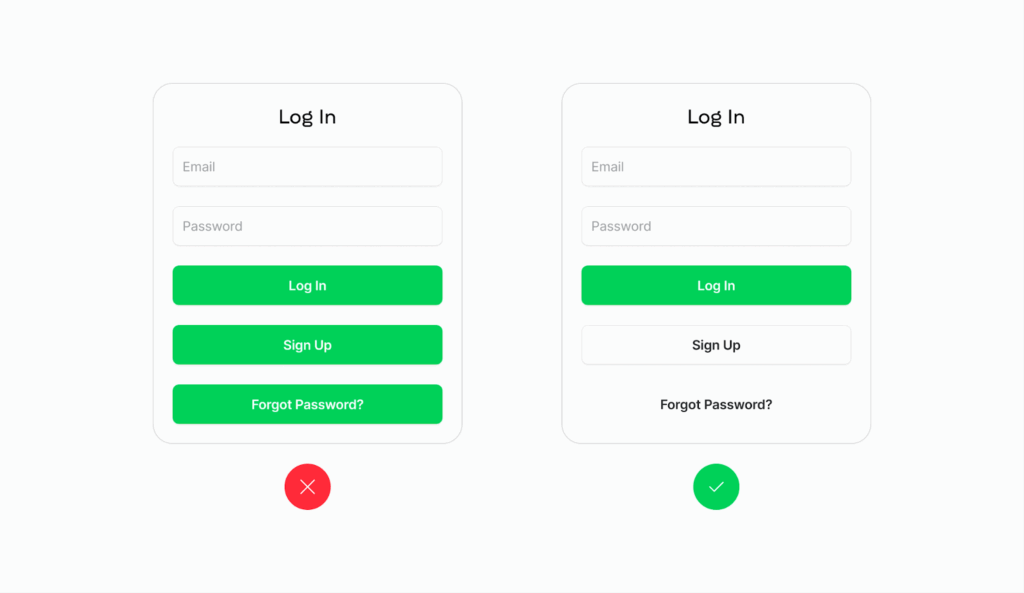
Issue 5: Unclear differentiation between primary and secondary buttons
It’s important to ensure users can easily differentiate primary buttons from secondary ones. Primary buttons should stand out prominently, while secondary actions should be less conspicuous but still easily noticeable. Here’s how to distinguish between them:
- Utilize bold colors, text, and larger sizes to emphasize primary actions.
- Conversely, employ subtler styling for secondary actions.
Here is an example of proper button differentiation:

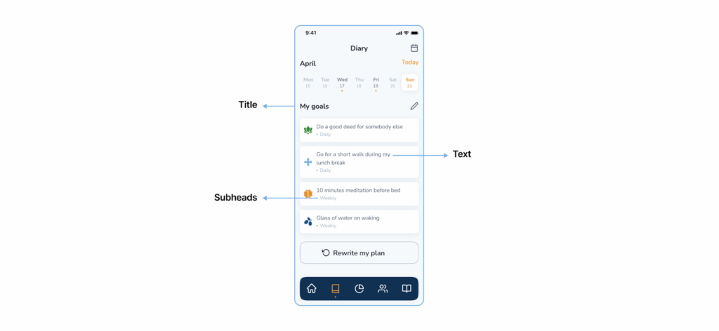
Issue 6: Lack of text hierarchy
To ensure users can easily grasp information, it’s crucial to organize text effectively. Here’s what you need to do:
- Start with a prominent title that stands out. Make it larger than other text on the page.
- Subheaders and other text should be noticeably smaller to indicate hierarchy.
- Create contrast between different text styles using size, weight, and color.
- Separate text blocks, using minimal space to link related information and ample space to distinguish between different blocks of information.
Here is an example of efficient text hierarchy:
Issue 7: Bad icon design
Selecting the appropriate symbol is crucial for conveying the meaning of an element clearly. Consistency in icon style across your app is key. Here are some tips for better icon design:
- Opt for vectors or SVG for your icons to guarantee sharpness across devices and resolutions.
- Ensure the message of each icon is easily understood.
- Choose between outlined or filled icons for uniformity.
- Maintain consistent line thickness and corner radius.
Here is an example of clear icon design:
Issue 8: Poor color contrast
Low contrast between interface elements can cause them to blend, resulting in a dull and difficult-to-read interface. You can assess the level of contrast between two colors using this website. Also, to check the contrast, you can use color contrast checker plugins in Figma. They indicate whether there’s enough contrast between text and background for comfortable reading.
And here are some tips for improving contrast:
- Use contrast to draw attention to important elements (such as calls to action) by employing high-contrast colors.
- Differentiate between sections of your app by utilizing contrast effectively. For instance, use distinct background colors to delineate the header, content, and footer.
- Create sufficient contrast between elements and the background. For example, when overlaying text on photos, ensure the text remains readable by maximizing the contrast between the photo and text.
Here is an example of how color contrast could be properly implemented in a log-in section of the app:
Issue 9: Too much user input required
While some scrolling and tapping are unavoidable, it’s best to minimize them. To address this, review your user flows and try to reduce the number of screens.
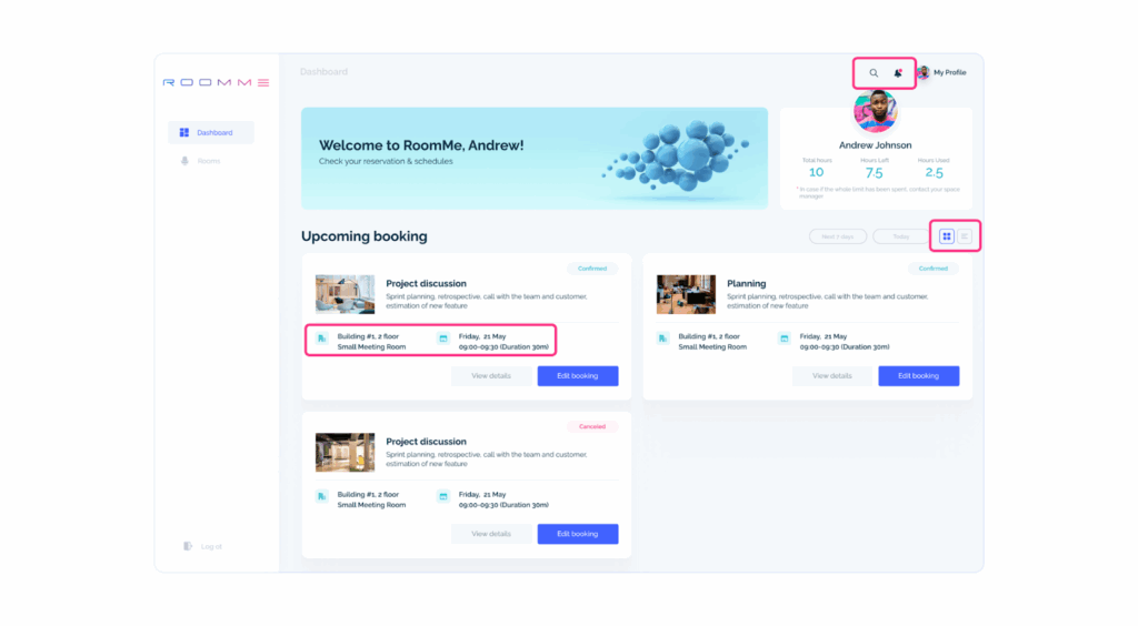
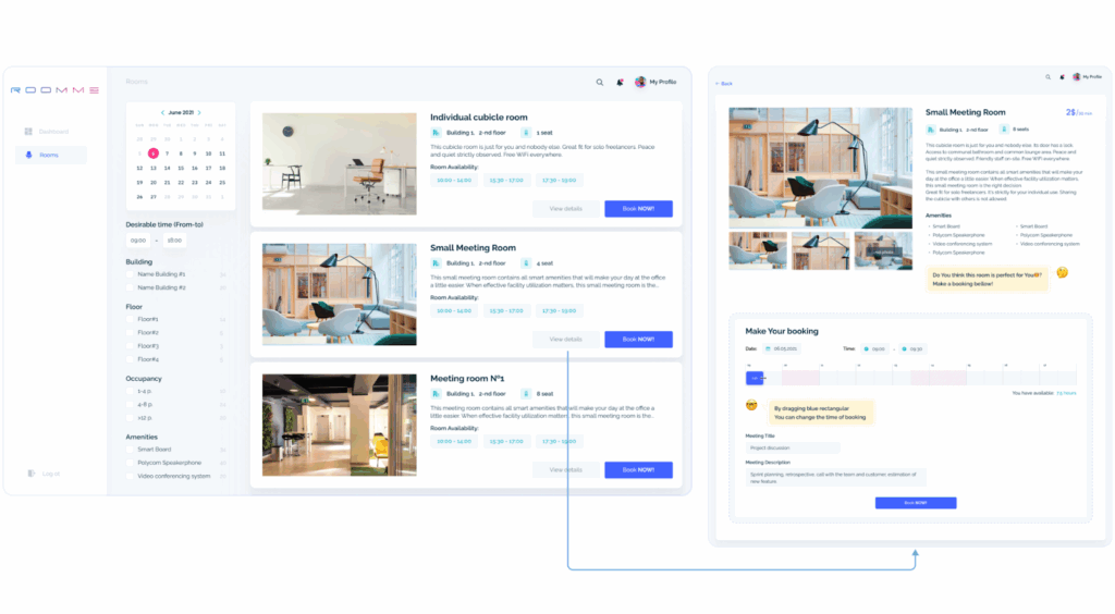
A typical example is the booking page. In a project for our client, RoomMe, we tackled the challenge of simplifying the process of offline office booking. Our goal was to streamline online booking, minimizing the number of clicks required. We achieved this by implementing a straightforward filter system that allows users to find rooms based on their preferences. Once users find a suitable room, they can book it directly from the list of available offices with just two clicks. We made it easier for users to accomplish their tasks efficiently.
Issue 10: Need to manually fill in data (long or confusing fill-in forms)
Having to repeatedly fill in details (such as shipping addresses, which typically remain the same for extended periods) can be both tedious and unnecessary. To streamline this process, consider implementing an auto-fill feature. This feature enables users to save their addresses and easily select them from a dropdown menu.
Below, here’s an example: the user can quickly select from a range of pre-saved addresses, saving time without the need for manual entry. This allows people to complete the task with just a few clicks.
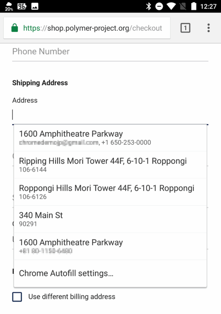
Source: Dev Channel
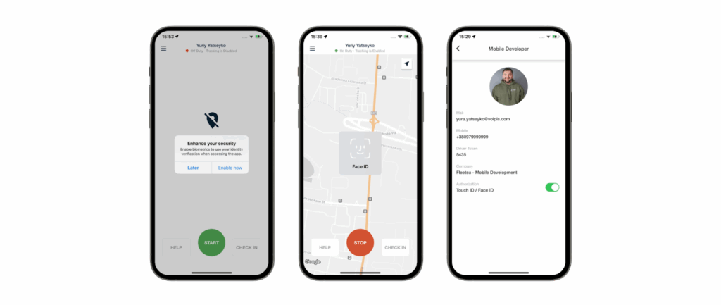
Another way to eliminate manual input is through scanning. For instance, we integrated biometric authorization (fingerprint or facial recognition) for one of our clients, Fleetsu. Users can simply scan their fingerprints or face to authenticate. This not only enhances security but also prevents unauthorized access.
Issue 11: Excessive notifications
While it’s nice to receive updates on topics of interest, nobody enjoys being inundated with notifications. To ensure you’re not overwhelming your users, consider this simple approach: ask them if they want to receive notifications about events and provide an option to opt out.

Image source: 6 Mobile Popup Examples That Capture Leads on All Devices
Users should manage their preferences to make sure they only get the notifications they want.
Another way to improve notifications is by organizing them into groups. This means only specific users will get certain notifications based on what they’re interested in or how active they are. For instance, you could send notifications about a sale only to users who have bought four or more items.
Issue 12: Inconsistent branding
Branding is all about crafting a distinct identity that conveys the app’s purpose, values, and personality.
Inconsistent design elements can make the app seem unprofessional and confuse users. To address this, designers should ensure that the app’s branding aligns with the company’s brand identity while also being engaging. It’s important to develop a style guide that outlines key design elements like colors, fonts, and icons for the app.
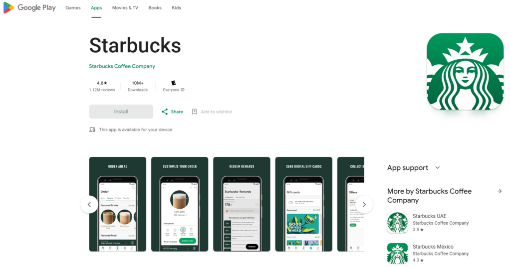
For instance, Starbucks employs the same color scheme, icons, and typography across its app.
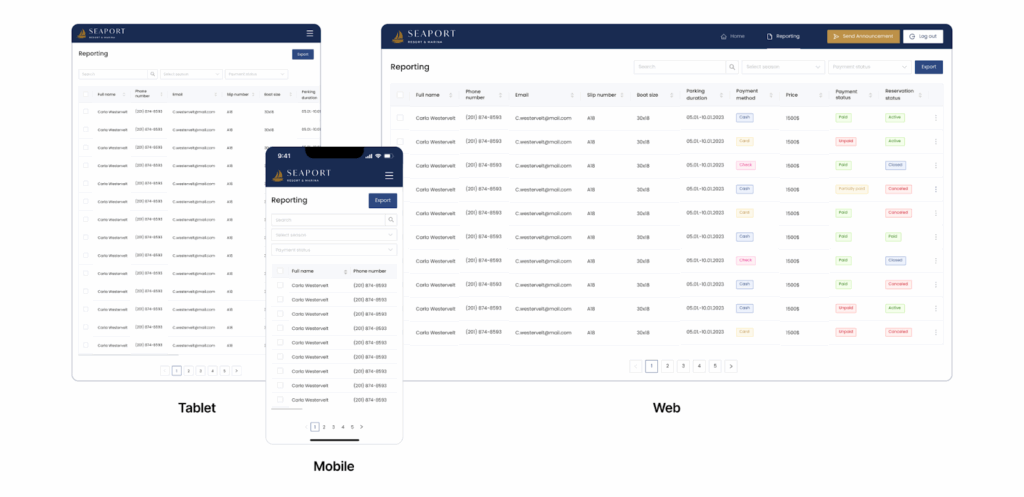
Issue 13: Non-responsive design
To ensure users have a smooth navigation experience, it’s crucial to tailor your navigation user interface to fit the dimensions of their device. Common methods include utilizing a rail, an always-present or collapsible navigation drawer, and a bottom app bar.
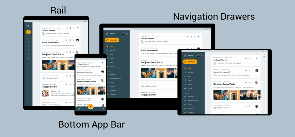
Image source: Examples of a rail, navigation drawers, and a bottom app bar
Here is an example of a responsive app design we recently created for our customer.
Issue 14: Inconsistency in UI elements
A uniform look not only enhances user experience but also helps users navigate your app more easily. To maintain design consistency, pay attention to the following:
- Use a consistent color palette for buttons, text, links, headers, footers, and other elements.
- Maintain consistent font styles.
- Choose either rounded or squared corners for shapes throughout your app, such as icons, cards, and buttons.
- Ensure consistent line thickness for icons, dividers, and other lines.
- Stick to default shadows.
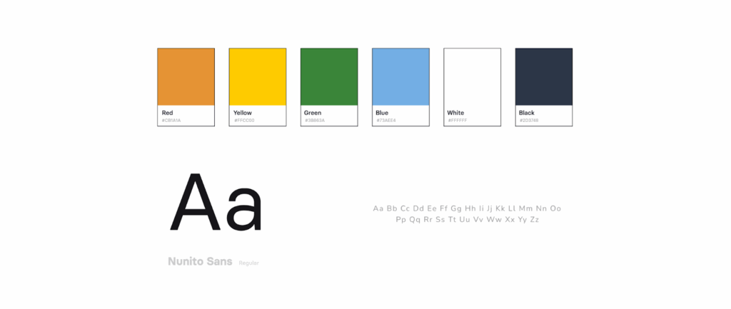
For example, here is the color palette we used when designing the MyDay App.
What is a design system? What mistakes can it have?
A design system is a collection of components, rules, style guides, and documentation used to create a consistent interface for a product. In simpler terms, it’s a toolbox of reusable UI elements that teams use to ensure a uniform user experience across digital products.
What mistakes it can have?
Inconsistent design patterns
When a design system lacks consistent design patterns, it can result in a confusing user experience. Users expect consistency, so encountering inconsistencies can be frustrating.
Poor documentation
Without clear and comprehensive documentation, it can become chaotic. This makes it difficult for designers and the development team to effectively use the system and be on the same page about it.
Lack of scalability
Without scalability in mind, a design system may struggle to accommodate the growth and evolution of the product. This can result in a cumbersome structure that’s hard to manage and update.
Accessibility problems
Problems such as low-contrast text, absent alternative text for images, and inaccessible interactive elements can impede user engagement.
Examples of how famous companies identify and fix app design issues
By truly considering your customers’ needs and making redesign decisions based on quantitative and qualitative data, you can ultimately reach all your app’s (and business) goals. However, it’s important to keep in mind that some issues are ruining the success of your product, while others barely impact anything and are only noticeable to perfectionist designers.
1) PlaceMakers redesign
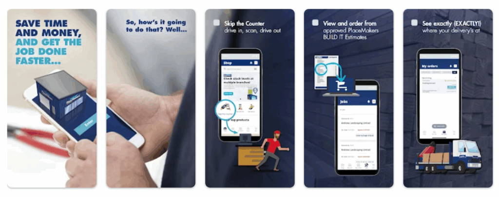
One famous example is PlaceMakers. The company doubled in-app sales after fixing a UX issue. By using an analytics tool UXCam, they analyzed session replays and heatmaps and discovered that their messaging for constrained products was too strong. With red and bold lettering communicating the product wasn’t available to order, users stopped purchasing in advance for future deliveries. The session replay feature showed that users were scrolling past materials with the Constrained Products tag. After that, they revamped the design of Constrained Products with a more positive approach, communicating to users that the product is available but delivery may take slightly longer. Once that was implemented, they saw that sales hadn’t just recovered from before – they had doubled.
2) Instagram redesign
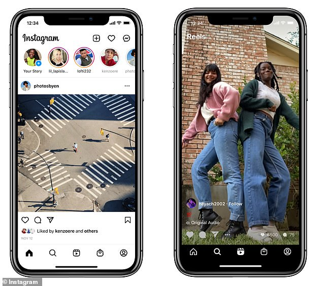
Instagram has refreshed its homepage, aiming for enhanced accessibility. One prominent change involves centering Reels, which now take the place of the post creation icon. Meanwhile, the ‘+’ icon and ‘heart’ button have shifted to the top right. Additionally, the ‘Shop’ tab has moved to the former position of the ‘heart’ button at the bottom of the page. This alteration aligns with Instagram’s strategy to integrate advertisements into Reels clips. The Instagram overhaul led to heightened user satisfaction, improved user engagement metrics, and garnered a positive response from the user community.
3) Costa Coffee redesign
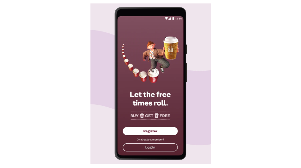
Another example is Costa Coffee, the company was able to increase app sign-ups by 15% through the overhaul of the registration segment within their application. They used an analytics tool to track events for all of the critical registration metrics and identified the biggest bottleneck: about 15% of new users dropped off after entering invalid passwords. After that, they made design changes that revamped the registration process.
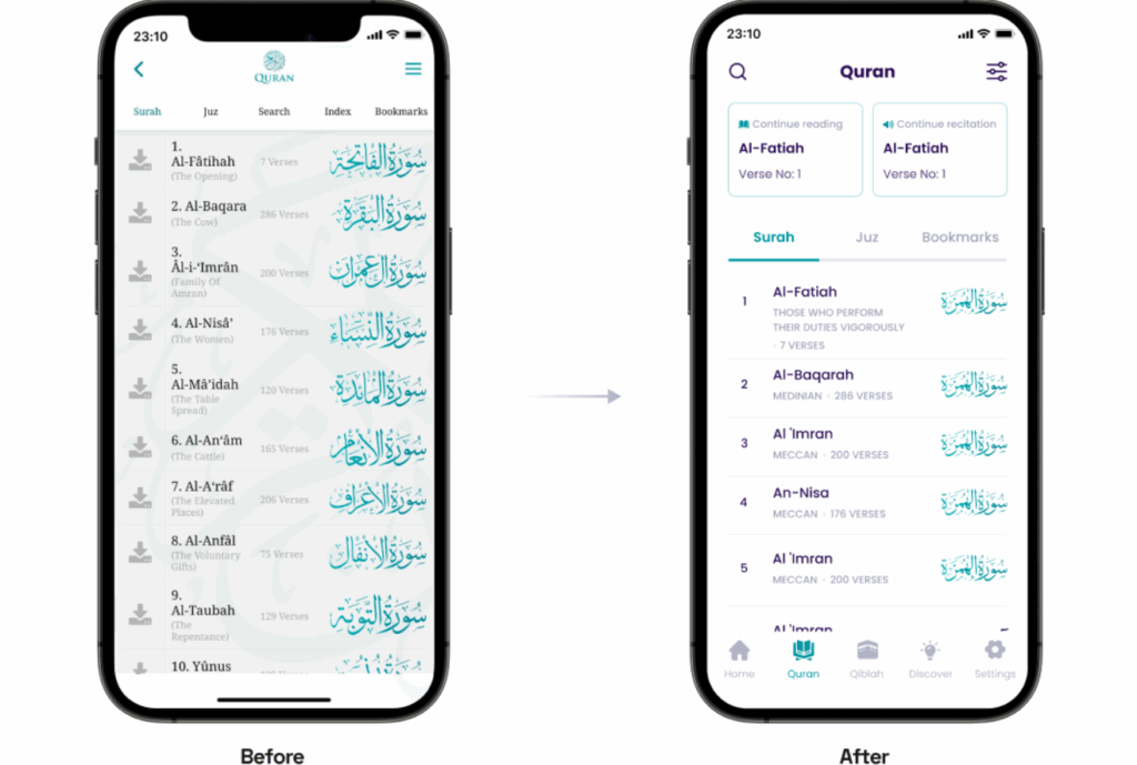
Case study: how our UX/UI designers found & fixed app usability issues for our customer
Let’s take as an example the case of one of our clients, a popular non-profit mobile app for Android and iOS The Holy Quran. Throughout our collaboration, we successfully elevated the app rating from 4.3 to 4.8, achieving an impressive milestone of surpassing 1 million downloads.
Issue: Complex UX flows hindering user navigation and feature access.
Solution: We conducted user research, simplified and streamlined complex UX flows, introducing intuitive navigation and enhancing feature accessibility.
A detailed exploration of this app redesign journey with a detailed account of each phase (and the strategic decisions made) can be found here.
Do you need to identify and fix your app usability issues? Our UX/UI design team can eliminate all problems effectively
Sometimes design issues are simple and easy to fix. And sometimes, it is the structure of a product that makes it so complicated to use. Consistently acknowledged as one of the top app development companies on Clutch, Volpis can help you find specific areas where your app users may encounter difficulties and implement targeted enhancements.
If have any questions about the potential improvements for your app, we welcome any inquiries. You can contact us via email at info@volpis.com or connect with us on LinkedIn.
Questions & Answers
FAQ
How do you evaluate an app design?
To evaluate an app design effectively, consider gathering user feedback to gain insights into their experience and preferences. Additionally, pay attention to all the details, ensuring that every aspect of the design contributes to a visually appealing and seamless user’s experience. Remember the golden rule of design: prioritize simplicity and functionality over cramming in too many features, and ensure your design works well across different platforms.
What makes a bad app design?
A bad app design typically lacks intuitive navigation, has confusing layouts, inconsistent branding, and fails to meet user expectations. It often results from skipping essential steps like beta testing and user feedback collection in the design process, leading to poor UX. Additionally, neglecting considerations for various screen sizes can exacerbate usability issues and hinder user engagement.
How do you identify and troubleshoot UX problems?
You can identify UX problems by performing usability testing, creating user personas, closely monitoring user interactions with the app, and gathering valuable feedback through user interviews, which can provide insights into user preferences and pain points. Beta testing allows for real-world testing of the app before its final release, enabling users to interact with the final screens and provide valuable feedback.
How can I improve my mobile app design?
Improve your mobile app design by prioritizing user experience, simplifying navigation, optimizing performance, and ensuring consistency in design elements. Focus on optimizing the home screen layout for easy access to key features and information. Implement a user-friendly search field to help users quickly find what they need. Additionally, test your design across different screen sizes, platforms, and devices to identify and fix any bugs that may affect performance.